
GPT Image 2 Onboarding Checklist Card Background Prompts
Create coordinated text-free onboarding card backgrounds while keeping setup steps, progress, permissions, and product guidance in real interface components.
Quick answer
Use GPT Image 2 only for low-detail, text-free decorative art behind or beside each onboarding task. Keep the real task name, step order, completion state, required permission, time estimate, skip option, help link, and progress in accessible UI. Give every card one distinct motif but the same palette, viewpoint, stroke weight, safe zones, and visual density so decoration supports scanning without becoming instructional evidence.
Who this guide is for
SaaS product teams, growth designers, lifecycle teams, and developers building first-run checklists, workspace setup, account activation, or guided trial experiences.
Recommended model
| Use case | Recommended model | Why |
|---|---|---|
| This workflow | GPT Image 2 for a coordinated family of text-free onboarding motifs | It can explore consistent visual metaphors while all operational instructions and live account states remain deterministic interface content. |
AIBase is an independent creative platform. Model names are shown only to identify supported underlying technologies and workflow choices.
Prompt template
Create a text-free decorative background for onboarding checklist card [step purpose]. Card size [ratio and pixels], protected zones [task label / progress / button / help link]. Motif: [one simple abstract object or path], composition [specific], palette [brand colors], rendering [flat paper / soft 3D / line art], shared family rules [viewpoint, stroke, shadow, density]. No interface screenshot, cursor, form, checkbox state, progress number, permission dialog, product logo, instruction, word, letter, number, badge, success claim, error state, or watermark.
Step-by-step workflow
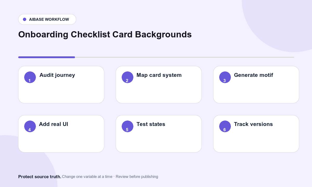
- Audit the real onboarding journey: audience, prerequisite, task order, optional versus required steps, permissions, success events, time estimates, skip rules, and support path.
- Assign one non-instructional motif to each task and define a shared art system for palette, viewpoint, stroke, lighting, corner radius, density, and safe zones.
- Generate the most constrained card first, validate the art direction at actual UI size, then reuse the approved rules for the remaining family.
- Place real task labels, state, progress, controls, permission context, help, and analytics in accessible components above or beside the generated artwork.
- Test incomplete, active, blocked, completed, skipped, error, loading, dark-mode, narrow-screen, reduced-motion, and localized states.
- Verify event tracking and completion logic independently from visuals, then document artwork source, prompt, version, alt treatment, owner, and rollback.
Example prompt variants
- Text-free 4:3 card background for connect a data source: three abstract rounded tiles linked by one dotted path, calm blue and sand palette, empty lower third for real controls, no UI or symbols.
- Text-free square card for invite a teammate: two overlapping translucent shapes with equal visual weight, soft paper style, top-right decorative cluster, clear left label zone, no people or count.
- Text-free wide card for publish first project: one abstract folded plane opening toward a small light field, shared viewpoint and shadows, clear center copy zone, no rocket, checkmark, metric, or word.
Quality checklist
- Task names, order, prerequisites, permission requests, time estimates, completion events, progress, and support content come from the real product system.
- The card family shares palette, rendering, viewpoint, spacing, density, safe zones, and contrast while each motif remains distinguishable.
- Artwork contains no fake UI, checkbox state, progress, warning, permission, account data, instruction, or success claim.
- Labels, buttons, focus order, screen-reader text, state changes, contrast, localization, and mobile layouts work without depending on decoration.
- Journey map, prompts, outputs, UI states, analytics validation, accessibility review, owner, and rollback are retained.
Mistakes to avoid
- Generating a complete onboarding UI screenshot and treating invented controls or state as a product specification.
- Letting decorative checkmarks, locks, warnings, or progress rings conflict with the user’s live state.
- Using different visual styles for every card so the checklist becomes noisy and harder to scan.
- Skipping blocked, permission-denied, localization, mobile, keyboard, and screen-reader states because the default card looks polished.
Related AIBase pages
Practical next step
Open the most relevant AIBase generator, run one narrow prompt first, and save the best result before adding more constraints. The fastest way to improve output quality is to compare one variable at a time: subject, camera, background, lighting, then final polish.