
GPT Image 2 Help Center Category Card Background Prompts
Design text-free help-center card families for setup, billing, account, troubleshooting, and integrations while keeping support content accurate and accessible.
Quick answer
Give each help category one simple text-free motif and a shared card grid, then add real labels, article counts, status, and links in accessible HTML. Use GPT Image 2 for low-detail decorative backgrounds only. Do not generate interface screenshots, warning states, plan entitlements, support availability, or instructional symbols that could be mistaken for current product guidance.
Who this guide is for
Support operations teams, technical writers, SaaS designers, and documentation owners building a searchable help-center landing page.
Recommended model
| Use case | Recommended model | Why |
|---|---|---|
| This workflow | GPT Image 2 for coordinated text-free support category concepts | It can explore a coherent visual family while authoritative labels, product states, article counts, and navigation remain real interface content. |
AIBase is an independent creative platform. Model names are shown only to identify supported underlying technologies and workflow choices.
Prompt template
Create one text-free help-center category card background for [setup / account / billing / troubleshooting / integrations]. Shared system: [palette, corner radius, depth, texture]. Category motif: [simple abstract path / secure layered shape / neutral transaction rhythm / resolved signal / modular connection]. Keep the center and lower third quiet for an accessible title, description, article count, and link. No word, letter, number, UI, screenshot, button, icon that resembles a real control, error code, price, plan, status, logo, cursor, notification, claim, or watermark.
Step-by-step workflow
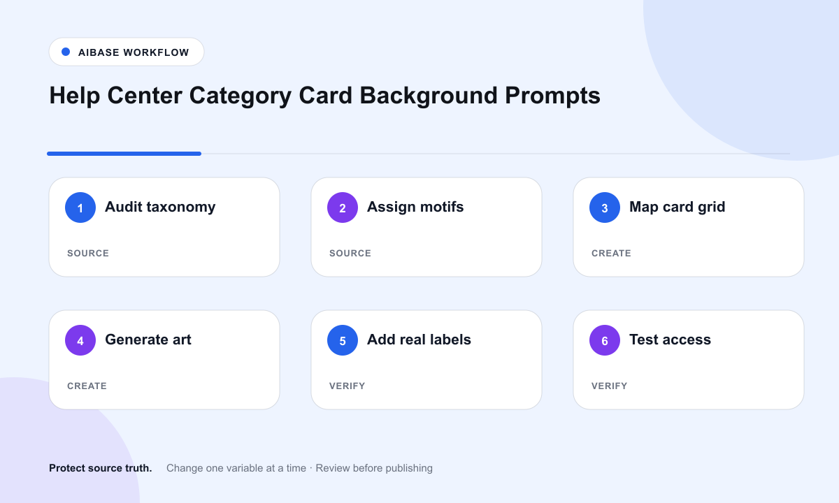
- Audit the current support taxonomy, article ownership, product versions, plan rules, localization, escalation routes, and search behavior.
- Assign each category a restrained metaphor and color accent that remains distinguishable without relying on color alone.
- Set fixed card dimensions, quiet text zones, image crop rules, contrast targets, and mobile stacking before generation.
- Generate one background per category with the same visual grammar and no interface, labels, numbers, or product evidence.
- Add real category names, descriptions, article counts, status notices, links, and search controls as semantic accessible components.
- Test keyboard order, screen readers, contrast, long translations, mobile crops, stale article counts, broken links, and product-version updates.
Example prompt variants
- Setup card background with three soft indigo planes forming a clear forward path, quiet lower title zone, no steps, numbers, arrows, UI, or words.
- Billing card background with calm green layered paper-like curves and one protected center, no currency, receipt, card number, price, or invoice text.
- Troubleshooting card background with an amber signal becoming orderly across the frame, no warning icon, error code, dashboard, status claim, or letters.
Quality checklist
- Support taxonomy, article count, product version, plan rules, links, escalation routes, and ownership are current.
- Each background is decorative and contains no fake UI, instruction, status, error, price, entitlement, or support promise.
- Category labels, descriptions, counts, search, and links remain semantic, editable, localizable, and keyboard accessible.
- The family is recognizable across desktop and mobile without sacrificing text contrast or relying only on color.
- Prompts, outputs, alt treatment, accessibility checks, content owner, review date, and rollback remain traceable.
Mistakes to avoid
- Generating realistic settings screens or error dialogs that quickly become inaccurate.
- Embedding category names or article counts in pixels where search and localization cannot use them.
- Using decorative controls, checkmarks, or warning badges that users interpret as interactive or authoritative.
- Launching a polished card system without testing keyboard navigation, long translations, broken links, and stale support content.
Related AIBase pages
Practical next step
Open the most relevant AIBase generator, run one narrow prompt first, and save the best result before adding more constraints. The fastest way to improve output quality is to compare one variable at a time: subject, camera, background, lighting, then final polish.