
GPT Image 2 Ecommerce Category Page Banner Prompts
Create text-free ecommerce category-page banner concepts with GPT Image 2 using clear merchandising intent, crop-safe composition, editable copy zones, and controlled product representation.
Quick answer
Start from the category’s shopping task, not a generic brand mood. Generate a text-free scene with one clear focal region and one quiet copy zone, then composite approved product packshots, headline, offer, navigation, and CTA in the site design. Test the banner above a real product grid on desktop and mobile before publishing.
Who this guide is for
Ecommerce merchandisers, store owners, growth teams, and designers producing collection headers for categories such as skincare, office gear, home storage, footwear, or seasonal gifts.
Recommended model
| Use case | Recommended model | Why |
|---|---|---|
| This workflow | GPT Image 2 text-to-image for background concepts | A text-to-image pass is useful for exploring category-level scenes and merchandising metaphors when exact SKUs, copy, pricing, and controls will remain separate approved layers. |
AIBase is an independent creative platform. Model names are shown only to identify supported underlying technologies and workflow choices.
Prompt template
Create a text-free ecommerce category-page banner background for [category] shoppers seeking [shopping goal]. Scene: [category-relevant environment or material system], featuring [generic non-branded objects or abstract category cues] in [focal region]. Reserve a calm, low-detail copy zone in [region]. Wide [desktop ratio] composition that also supports a [mobile crop], with essential detail inside the shared safe area. Lighting [direction], palette [approved colors], visual hierarchy that leads into the product grid. No text, letters, logo, price, discount, CTA, rating, badge, fake product label, unsupported claim, identifiable person, watermark, border, or crucial object at crop edges.
Step-by-step workflow
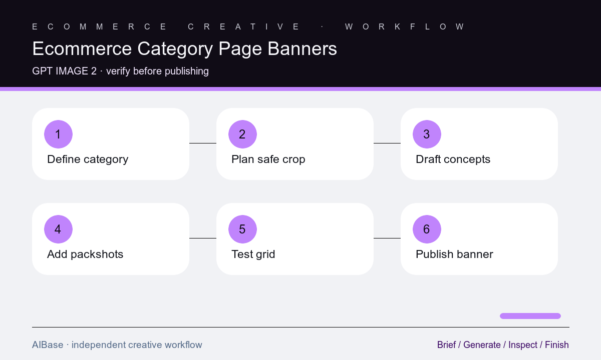
- Define the category, shopper question, destination filters, current assortment, seasonal context, approved palette, headline length, CTA, and desktop and mobile dimensions.
- Choose one visual system tied to the merchandise—material, use environment, scale, color family, or organizing gesture—and avoid depicting an invented hero SKU.
- Sketch the shared crop-safe zone, focal region, copy zone, header overlap, and transition into the first product-grid row before writing the prompt.
- Generate three text-free directions that change only the scene treatment, then compare them behind the same approved headline, CTA, and navigation.
- Composite real packshots only when needed, using approved files and preserving their scale, labels, colors, edges, shadows, and merchandising order.
- Review the live page at target breakpoints for readability, category recognition, crop, loading weight, accessibility, product-grid competition, and destination accuracy.
Example prompt variants
- Wide text-free running-shoes category banner background, abstract track-lane rhythm and breathable mesh texture cues on the right, calm charcoal copy zone left, coral accent, shared mobile-safe center, no shoe brand, product, text, badge, or athlete.
- Text-free kitchen-storage collection header, modular translucent containers suggested as simple non-branded silhouettes on the left, warm pantry light, quiet cream copy zone right, usable wide and portrait crops, no labels or food claims.
- Text-free desk-accessories category scene with cork, brushed metal, cable-routing arcs, and soft daylight, focal material arrangement lower right, low-detail navy copy zone upper left, no readable device UI, logo, or invented SKU.
Quality checklist
- The visual communicates the category and shopping context before the user reads the headline, without impersonating a real product or brand.
- The focal point, copy zone, navigation clearance, and essential category cues survive every approved desktop, tablet, and mobile crop.
- Headline, CTA, prices, discounts, badges, ratings, labels, logos, and product packshots remain editable approved layers rather than generated pixels.
- Contrast, reading order, image weight, alt-text treatment, layout shift, and the handoff into filters and product cards meet site requirements.
- The banner reflects the current assortment and destination page without unsupported availability, performance, sustainability, popularity, or seasonal claims.
Mistakes to avoid
- Generating a polished hero for a broad brand mood that does not help shoppers recognize the category beneath it.
- Prompting exact products, copy, prices, discount badges, ratings, and CTA buttons into one image that cannot be corrected or localized.
- Designing only for a wide desktop frame and losing the focal subject, category cue, or copy contrast in the mobile crop.
- Letting a visually busy banner compete with navigation, filters, product cards, or the first row of merchandise.
Related AIBase pages
- Open GPT Image 2
- Create a Shopify hero banner
- Build product bundle photos
- Plan ecommerce product images
Practical next step
Open the most relevant AIBase generator, run one narrow prompt first, and save the best result before adding more constraints. The fastest way to improve output quality is to compare one variable at a time: subject, camera, background, lighting, then final polish.